MataMeal
Case Study ·
UX/UI ·
Branding ·
Prototyping ·
Mobile
Role
Product Designer (UX/UI)
Timeline
Aug 2025 - Sep 2025
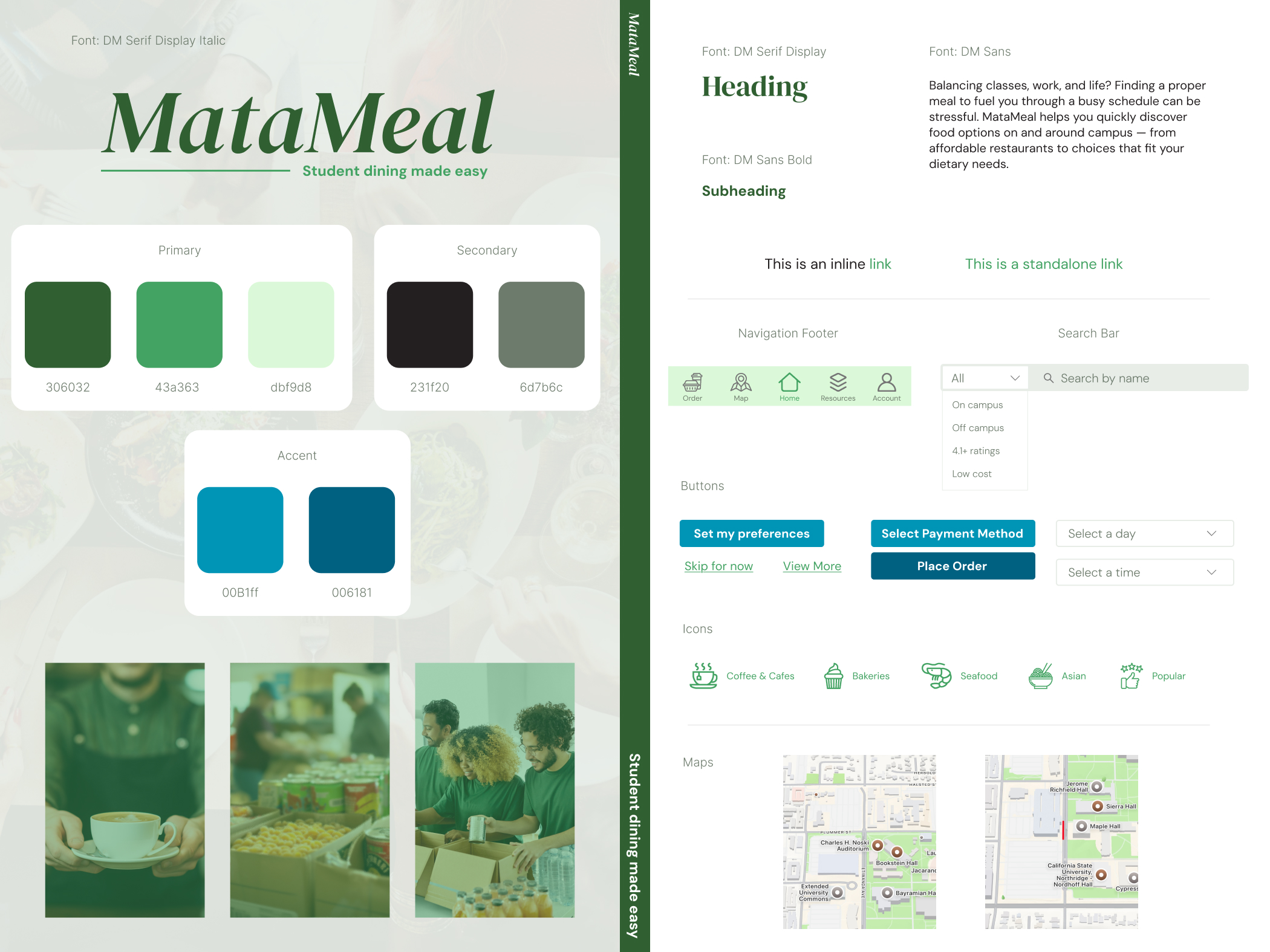
Tools
Figma, Google Forms
Overview
Many college students struggle to balance busy schedules, limited budgets, and access to nutritious meals. How might we make it easier for students to discover and choose dining options around campus?
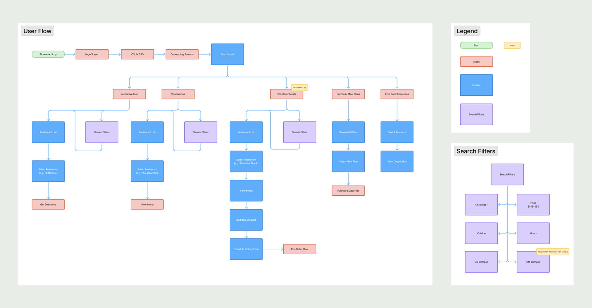
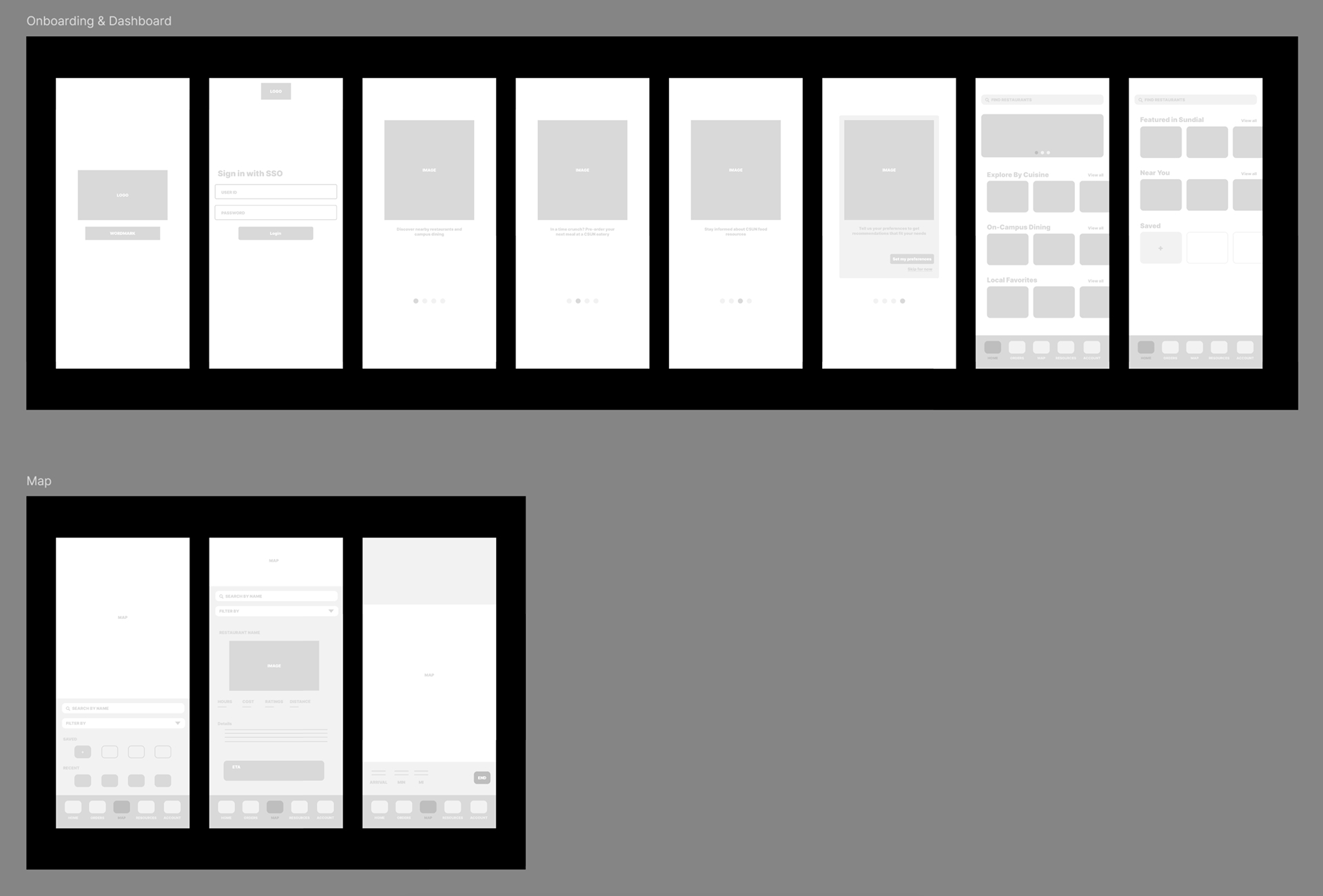
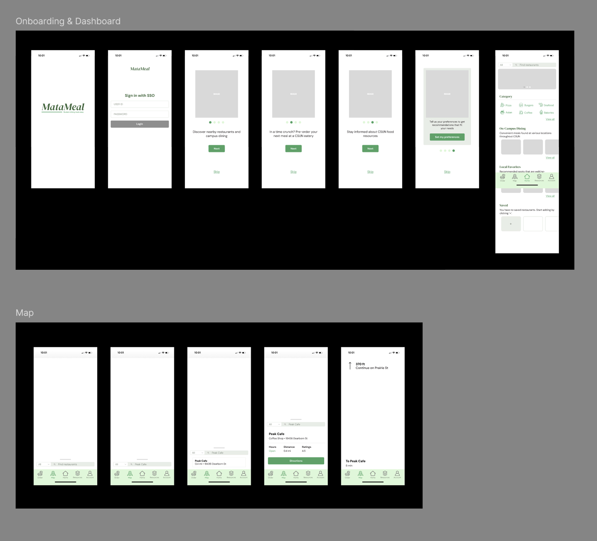
MataMeal is a mobile app designed to make food access easier and more convenient for CSUN students. Users can quickly discover dining options both on and near campus, view important details like price range, walkability, parking, and access student-exclusive deals and discounts. The app also highlights CSUN food resources such as the food pantry, weekly farmers market, and meal programs to support students who may need additional assistance.
Problem Statement
Ethan, a student athlete, needs a way to locate nutritious food options quickly because his practice schedule leaves little time to search for meals.
Hypothesis
We believe that by creating an app that allows students to pre-order meals, discover nearby eateries, and connect with food resources, it will lessen the stress maintaining a healthy eating routine while balancing busy schedules. We will know this to be true when we see students regularly use the app to plan meals and locate food options that meet their needs.
Research
To better understand student experiences with food access on and around campus, I distributed a 10-question survey, receiving 26 total responses, and held one-on-one interviews with three CSUN students. This research helped uncover common habits, attittudes, and painpoints related to student eating routines, spending patterns, and awareness of food resources.
Interview Participants
To ensure a diverse range of perspectives, partcipants were selected to reflect varying levels of awareness of food options around CSUN.

Agra Arachchi
spends 8+ hours on campus with long breaks to get food

Ryan Daeenejad
balances student‑teaching and classes, only short windows to eat

Keyla Ramirez
first‑time transfer student with limited knowledge of campus options
Interview Highlights
- Every participant said maintaining a healthy diet was difficult
- When balancing different responsibilities, it's hard to stay mindful of what you're eating
- Participants had mixed opinions on food variety, some noting on-campus options being more diverse, others stating the opposite
- Perception seems to change depending how frequent or familiar a student is being on campus
- All participants stated that price and convenience were the leading factors that dictate their dining decisions
Survey Highlights
- 54% said maintaining a healthy diet is difficult
- 80% reported a typical meal budget of $15 or less
- 62% were dissatisfied with the pricing of food ON campus
- 47% were dissatisfied with the pricing of food OFF campus
- 58% often choose convenience over eating healthy.
- All respondents indicated Price as the leading factor that dictates their dining decisions, followed by Distance from campus.
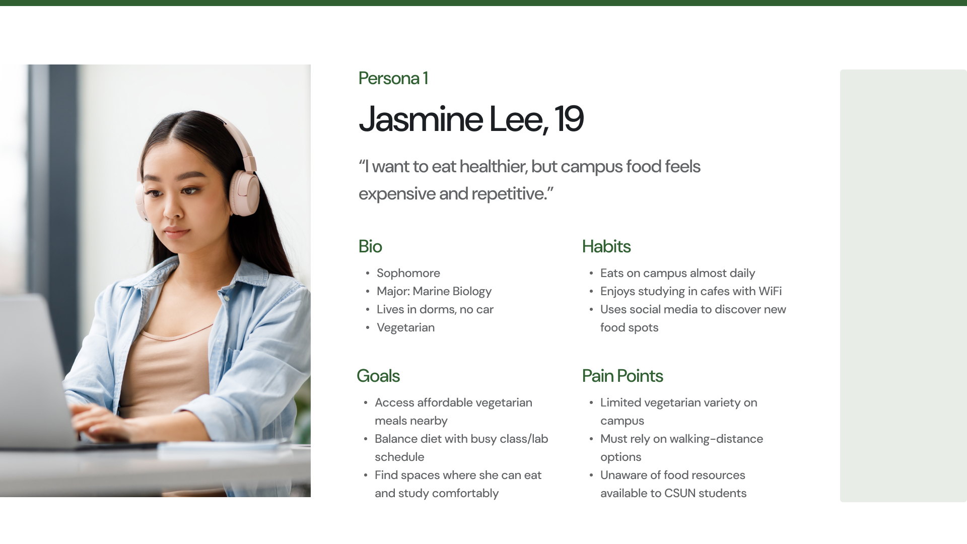
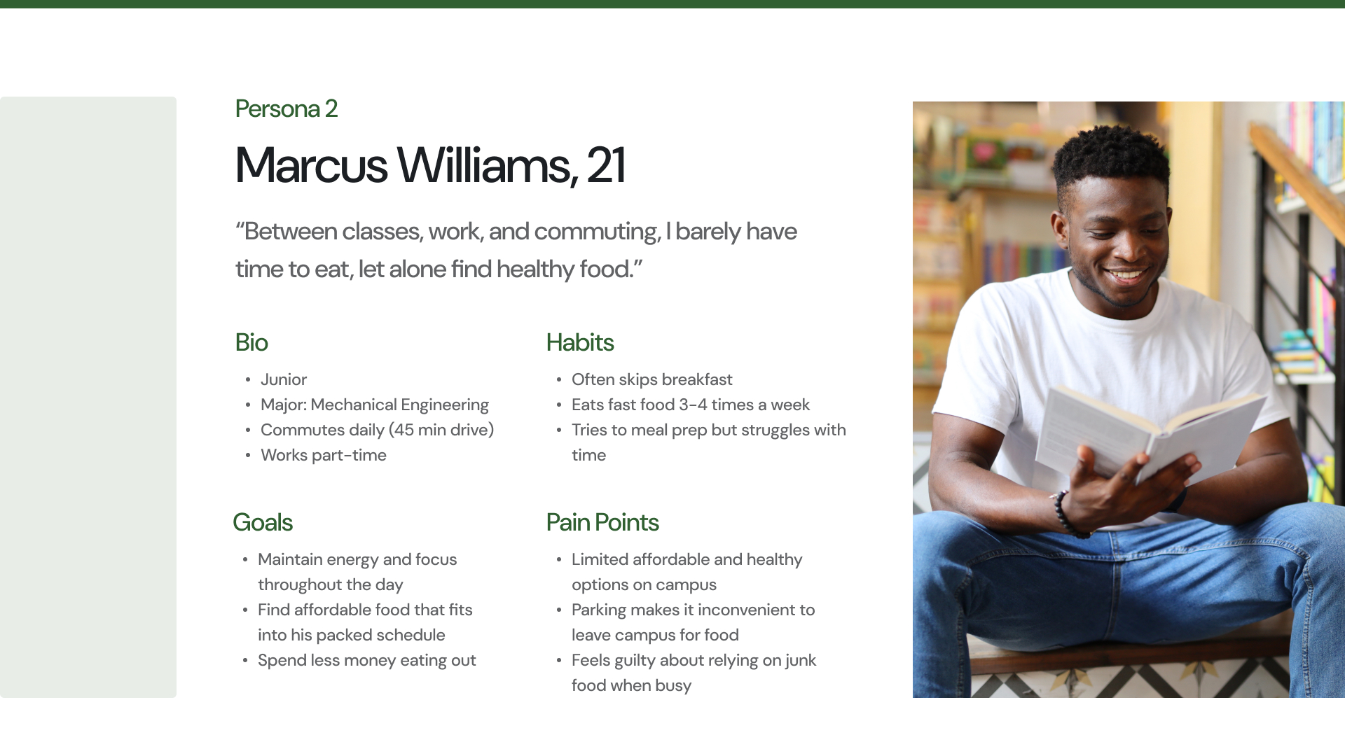
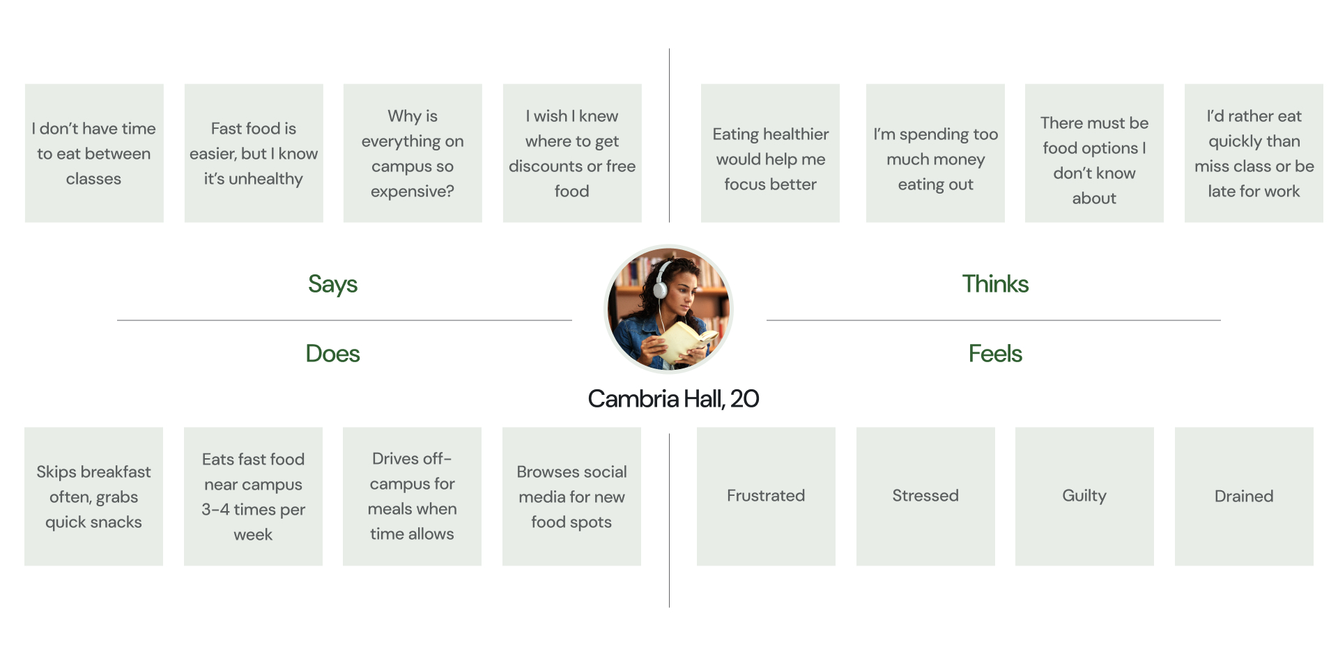
Data Synthesis
User Personas
Based on these insights gathered from my research, I created user personas that reflect the varying lifestyles, priorities, and struggles students face when trying to eat well at CSUN. These personas allowed me to empathize with my user base and better visualize their day-to-day decision-making around food.