Cincinnati Steam
Case Study ·
UX/UI ·
Branding ·
Web Design ·
Responsive

Role
Product Designer (UX/UI), Front End Developer
Timeline
Nov 2024 - Dec 2024
Tools
Photoshop, Illustrator, XD, HTML, CSS, Javascript, Bootstrap
Overview
In this project, I envisioned a concept NBA franchise called the Cincinnati Steam, and brought it to life by designing their visual identity and developing the front-end interface for their dedicated website. As one of my first projects involving web design, this was a rewarding experience that pushed me to grow and strengthen both my design and coding abilities.
Concept
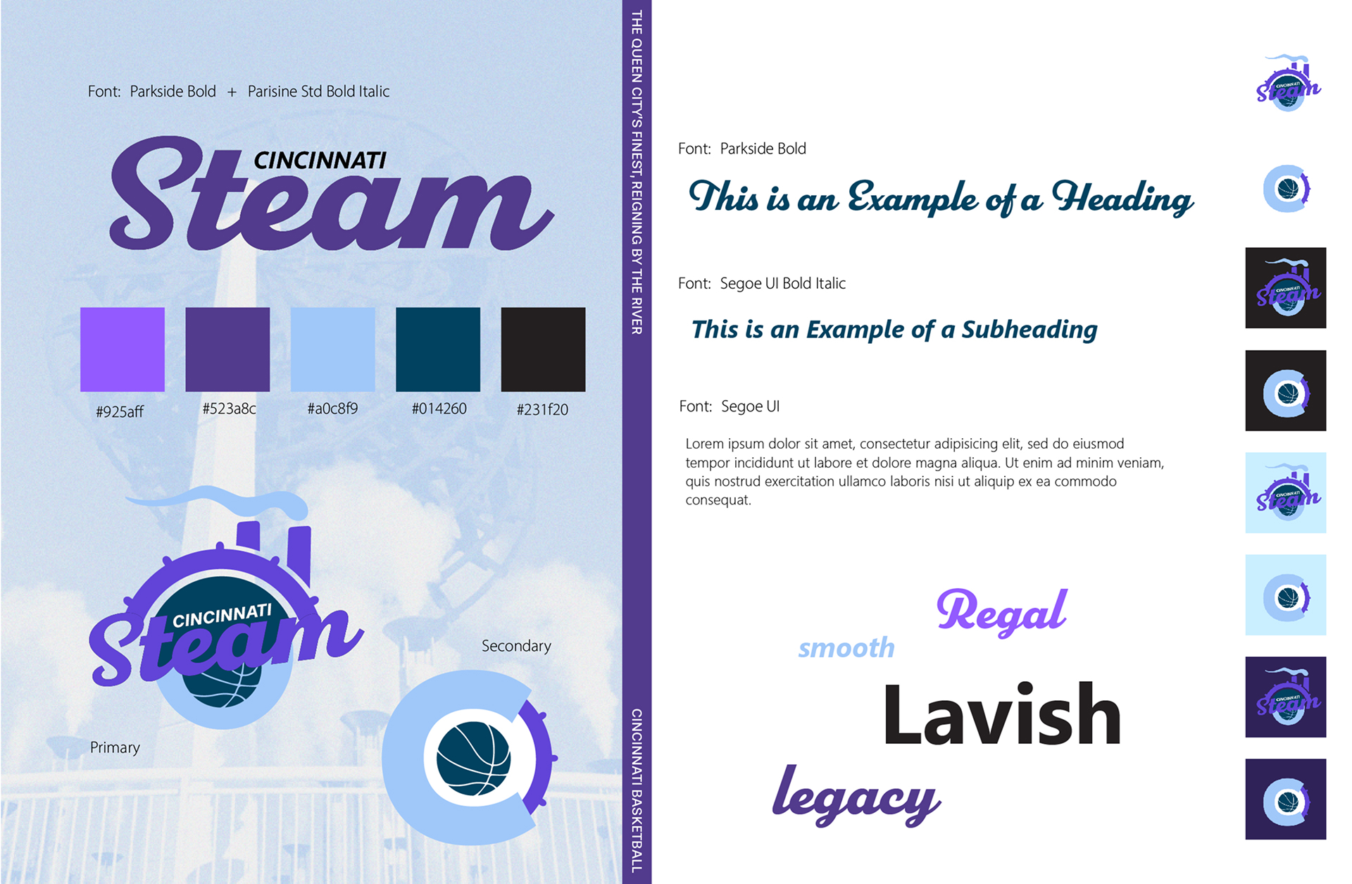
The Cincinnati Steam is a concept for an NBA expansion team. Located at the nexus of Ohio, Kentucky, and Indiana, a team based in Cincinnati would be at the heart of basketball country. The name “Steam” originates from the city’s history of steam power and early usage of steamboats along the Ohio river.
Define
To better inform my design decisions, I first needed to understand who I'm designing for? How can I create a team identity that resonates with basketball fans? How do I design a site that's worth visiting and provides functionality that fans are looking for? To answer these questions, I began outlining my target market.
Target Market
The demographics of a professional basketball team based in Cincinnati would logically coincide with existing audiences of the NBA, while having a large focus on Cincinnati residents.
- Ages: All ages—emphasis on gaining new, younger audiences while maintaining the interests of current NBA fans
- Sex: Predominantly male, but inclusive to all genders
- Income: Middle class—those who have expendable incomes to attend sporting events or purchase team merchandise
- Location: Large focus on Cincinnati and Ohio residents, but inclusive to any basketball fans across the globe
- Needs: A team that reflects Cincinnati's identity, celebrates its history, and fosters local pride. A source that fills the city's lack in professional basketball taht generates hype and delivers entertaining experiences. A sense of community.
- Interests: Basketball, NBA media and competition, professional sports
- Frustration: Lack of professional basketball since the orignal Cincinnati Royals' relocation in 1972
Objectives
With my target market outlined and their wants and needs in mind, I created these primary goals that would lead my design decisions. I needed to:
- Design a basketball team identity that captures the spirit of Cincinnati
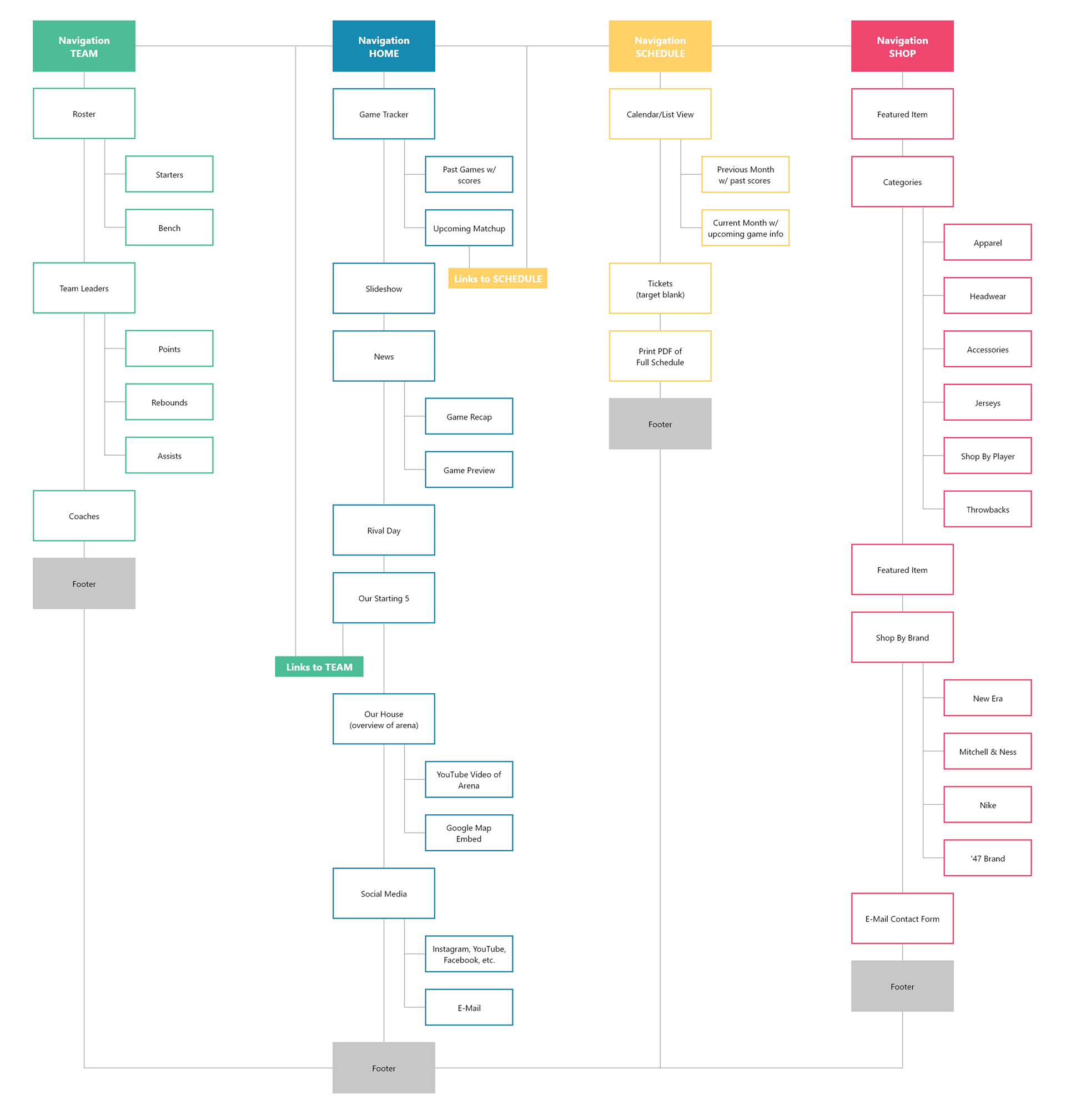
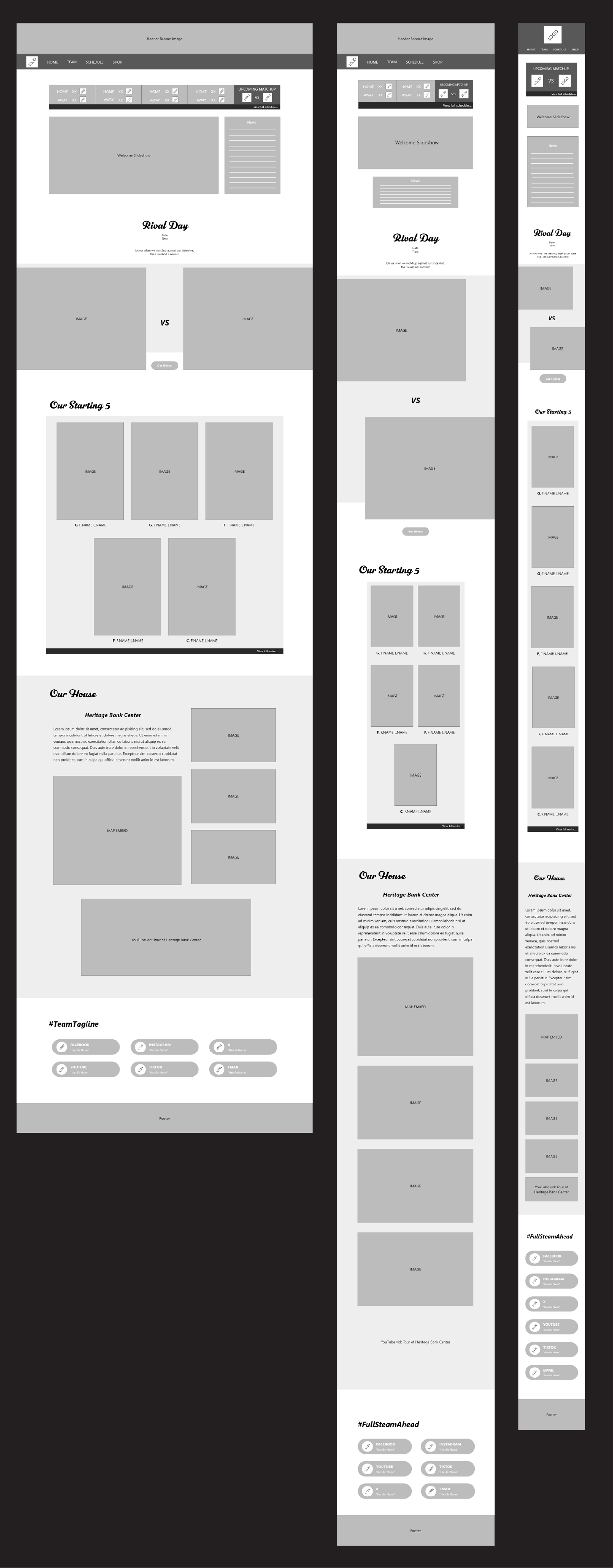
- Develop a website that matches that visual identity while serving as an engaging resource for fans
Design
Having my primary objectives established, I began ideating concepts for the team's identity. Doing quick research into Cincinnati's culture and history, I brainstormed a list of possible team names, eventually landing on the Cincinnati Steam—favoring it for its clever alliteration and nod to the city's industrial heritage and steamboat legacy along the Ohio River.
Settling on this name, I now had a baseline to explore potential imagery and iconography.
Iterations
I started to create style guides using images I found online as inspiration for color palette and typography.
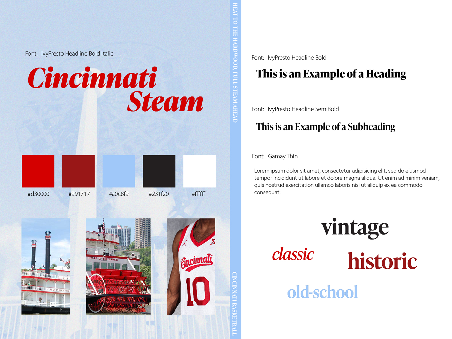
Design 1
For this first design, I went for a vintage feel inspired by the look of classic steamboats. The red, white and blue color scheme is a combination used by many sports teams, like the Chicago Cubs or the Los Angeles Clippers, bringing a sense of familiarity. Still, I realized that while familiar motifs can lend credibility, they also risk blending in. Finding that sweet spot between fitting into the NBA's visual language and standing apart as something new became a tough challenge to balance. That said, I felt this was still a strong first iteration, capturing the aesthetics that first come to mind when I think of steamboats.
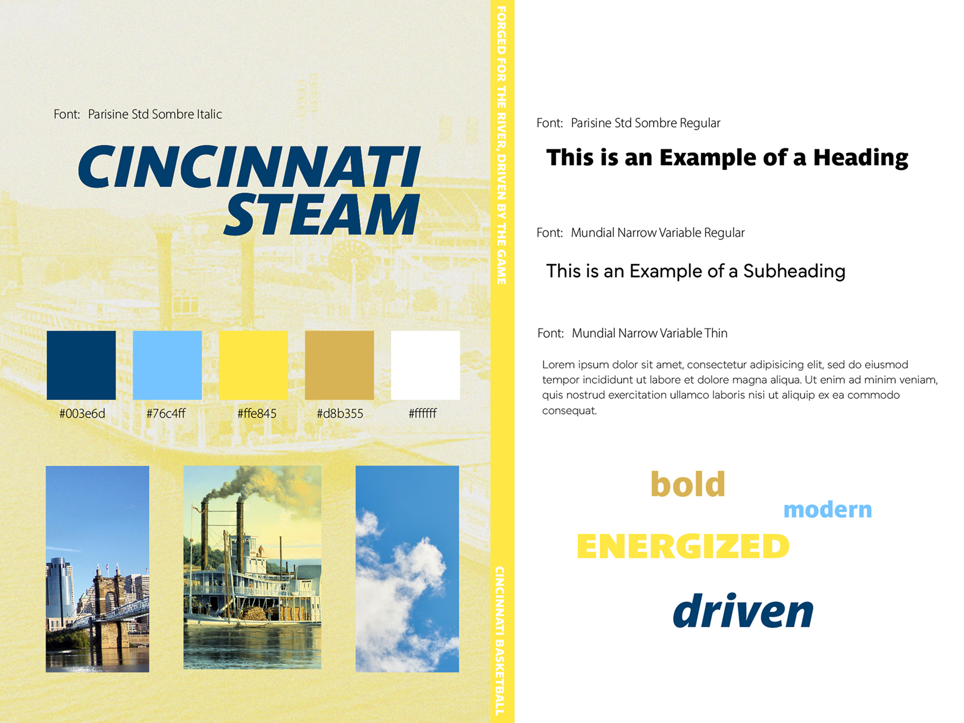
Design 2
While I was pleased with my first round of designs, I didn't want to limit myself from exploring other options. This energetic yellow design accompanied by an italic font conveyed movement and felt very sporty. In spite of that, this design didn't feel very emblematic of Cincinnati. It was also very similar to the nearby Indiana Pacers, once again bringing up the issue of being too close to existing designs—perhaps to an even greater degree than the previous round.
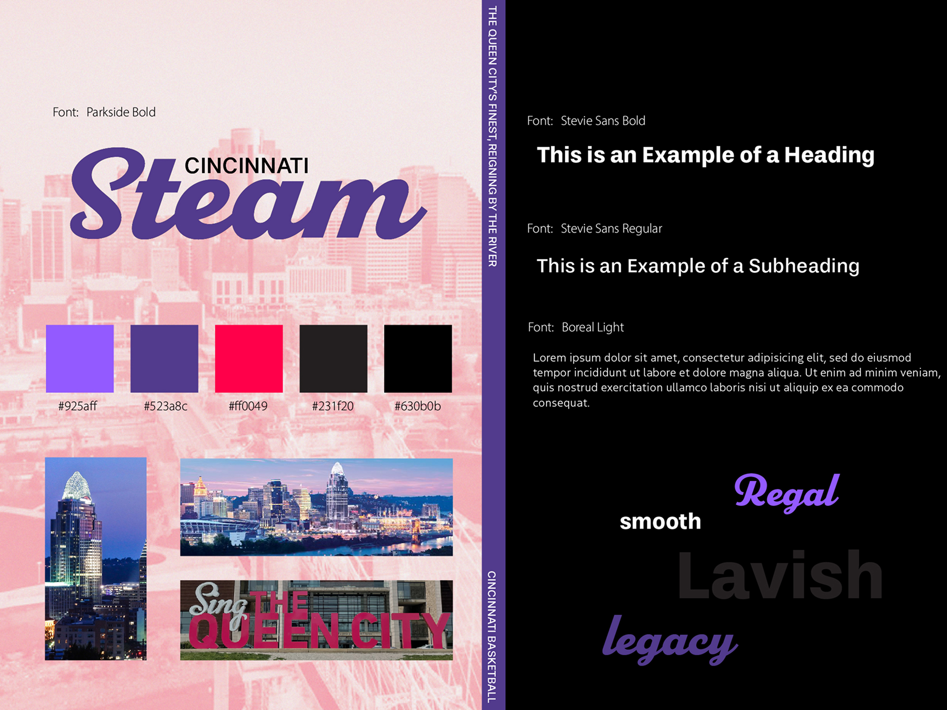
Design 3
For this third design, I challenged myself to take more creative risks than in previous iterations. Drawing inspiration from Cincinnati's nickname, "The Queen City," and its status as the crown jewel of the MidWest during the 1800s, I chose a royal purple paired with a vibrant pink. I was drawn to this combination for how it challenges the perception of pink and purple as purely "feminine" colors, instead presenting them as bold, confident, and commanding. While this palette diverges from typical NBA branding, I would argue the design still has its place within the league's predominantly male culture.
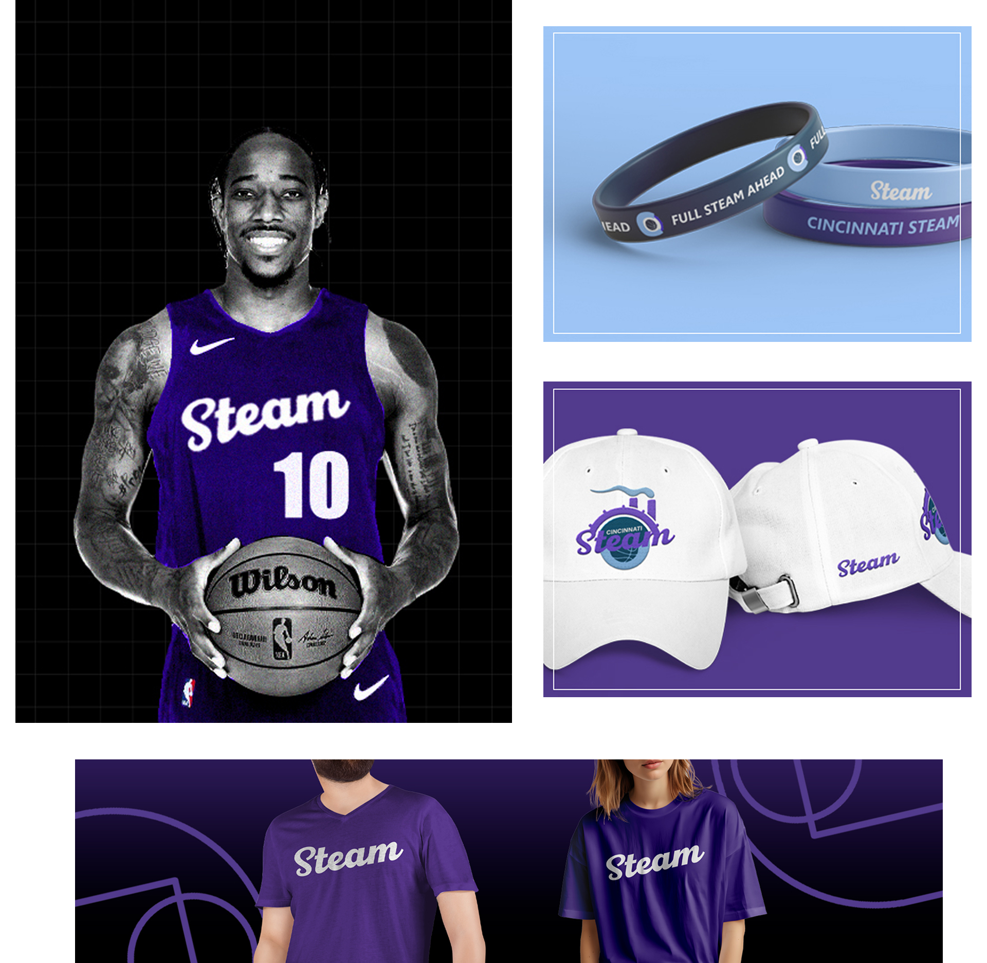
Final Style Guide
After receiving critiques for my initial designs, it was decided that the best course of action moving forward was to combine elements from Design 1 and Design 3, leading to the creation of this final style guide.